Fixed-height cards are a staple of modern web design, promising clean grids and perfect alignment. But as many developers discover, this visual harmony often comes at a cost. When content shifts—due to translations, user font size adjustments, or even minor copy edits—these rigid containers can shatter the user experience. This article explores the hidden fragility of fixed-height cards and offers insights on how to design more resilient components.
1. The Design Mirage: Perfect Alignment That Hides Future Problems
Every fixed-height card starts as a designer's dream. In the mockup, titles are short, excerpts fit snugly, and the grid looks flawless. The layout appears stable, and it's easy to assume the implementation will hold up. But this stability is an illusion. It relies on the assumption that content will never exceed the predetermined pixel boundaries. In reality, this assumption is almost never correct, especially in multilingual or accessibility-conscious applications.
2. Content Changes Are the Real Enemy
The moment an editor updates a headline, a translator works on a French version, or a user increases their browser's default font size for readability, the fixed height becomes a constraint. Suddenly, the carefully aligned cards start to falter. Text may overflow, clip, or push against neighboring elements. These changes are not rare—they are a daily reality for any dynamic website. Designers and developers must plan for variability from the start.
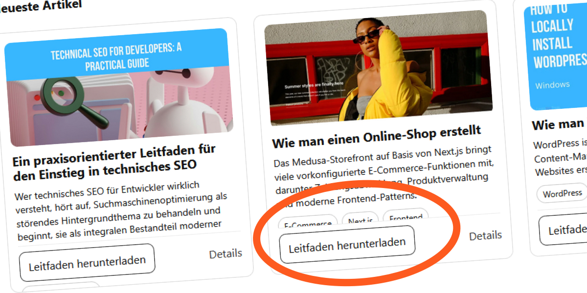
3. A Real-World Example: The “Recent Articles” Section
Consider a blog's “Recent Articles” section designed with fixed-height cards. Initially, all English titles are short and fit comfortably. But when the site is translated into French, words become longer—'Recent' becomes 'Récent', and titles expand. The fixed card height now forces text truncation, cutting off important headlines. German translations make the situation worse, often requiring more characters and breaking the layout entirely. This example demonstrates how language-specific content can destabilize a seemingly solid design.
4. The CSS Trap: Line Clamping and Fixed Heights
To enforce visual consistency, developers often use CSS line clamping with -webkit-line-clamp alongside a fixed height. For instance, setting the title to show only two lines and the excerpt to three lines, then hiding overflow. While this looks good in the browser, it creates a fragile relationship between content and container. The code .card__title { height: 44px; -webkit-line-clamp: 2; overflow: hidden; } assumes the text will never need more space. But as soon as font sizes or word lengths change, the clamp fails silently.
5. What Happens When You Remove overflow: hidden
To reveal the fragility, remove the safety net of overflow: hidden. Without it, the card content overflows its container, spilling into adjacent elements. Text that was once hidden now creates visual clutter and broken layouts. This open display of failure is actually helpful—it shows exactly where the assumption of fixed height breaks down. But in production, overflow: hidden often masks these issues until users report missing text or awkward layouts.

6. The Hidden Danger of overflow: hidden
Setting overflow: hidden on fixed-height cards is common, but it's a double-edged sword. While it neatly clips content that doesn't fit, it also hides critical information. Users may never see the full headline or excerpt, especially if they have larger font sizes due to low vision or reading preferences. This harms accessibility and user trust. The problem is not visible in the design mockup, so it's often overlooked until real-world usage exposes the gaps.
7. Why Designers Love Fixed Heights
Fixed heights appeal to designers because they create a strong visual rhythm. Cards with equal heights align perfectly in a grid, giving a sense of order and predictability. This is especially important for e-commerce or portfolio sites. However, this visual benefit comes at the expense of content flexibility. The human eye appreciates alignment, but it also values readability. Striking the right balance requires moving beyond fixed dimensions to more adaptive solutions.
8. A Better Approach: Let Content Drive the Height
The most resilient card layouts avoid fixed heights altogether. Instead, use min-height to ensure a minimum consistent size while allowing cards to grow if content requires it. This preserves visual alignment for short content but gracefully handles longer text. Alternatively, use JavaScript to equalize heights dynamically, or leverage CSS grid with grid-auto-rows: min-content. The goal is to design for variability, not against it. By embracing content-driven heights, you create components that work across languages, user settings, and editors' updates.
Fixed-height cards are not inherently bad, but they demand a deeper understanding of content variability. The next time you reach for a fixed height, ask yourself: what happens when the content grows? By adopting flexible strategies, you can build layouts that are both elegant and robust—surviving real-world content changes without breaking the user experience.